
BRAND PRINT AND DIGITAL
Print and Digital ranges from magazines, printed brand collateral, packaging, and digital social assets. It’s my goal to always cater to the aesthetic of the client while delivering the best iteration of their brief.
-
It all begins with an idea. Maybe you want to launch a business. Maybe you want to turn a hobby into something more.
-
It all begins with an idea. Maybe you want to launch a business. Maybe you want to turn a hobby into something more.
-
It all begins with an idea. Maybe you want to launch a business. Maybe you want to turn a hobby into something more.
-
Item description
-
Digital design covers social media marketing, digital ads and banners.
TILLAMOOK BLOCK JAMS CAMPAIGN VISUAL CENTER
The Block Jams theme centered around a retro 70’s/ 80’s aesthetic, a series of collaborative Tik Tok musical numbers, and retro music. In my exploration I found inspiration in the traditional 80’s VHS box. Additionally there was initial concept provided by 72 and Sunny agency for an orange boombox. However I took it a bit further with a cheese block boombox created in Photoshop. For additional assets I created a logo, musical notes, and a pattern, that tied into the developing 2023 brand refresh patterns. Additional projects I designed include T-shirt, promo box, mini mic cheddar block (manufactured by PFG) , boombox lunch box (manufactured by PFG) and out of home billboards and ads. Graphics can be seen in the 2023 commercial. Block Jams continued on through a Hudson Yards experiential event that I designed all graphics for and a Creamery Food Truck.


NYC Hudson Yards Pop Up- for full graphic description and more images check out my graphic experiential section.

Creamery Food Truck- for full graphic description and and more images check out my graphic experiential section.


GOODIES GENERAL MARKETING MATERIALS AND SNACK SWAP
Utilizing the branded characters, core color palette and secondary color palette from the characters story product posts were created. The flavor profile icons are used in the upper corners for brand recognition along with the corresponding colors.

Goodies regularly puts on community events. One example can be seen below through the IG stories, map postcard, and IG carousel.

Check out branding identity for Goodies brand and character development.
TILLAMOOK 2023 BRAND REFRESH
Looking to simplify the overall direction for the upcoming year, I was tasked to create a new visual center for 2023 shopper, general layouts, and smaller campaigns in less than a week. Utilizing the 3D type direction from earlier visual centers, I came up with a easy to execute iteration for the 3D type. Colors moved from Tillamook cream and Tillamook blue to a product color story, while creating some visual interest with a split color direction. Patterns were created as an allover go to for merch, social media posts, and general backgrounds in the themed color palette.
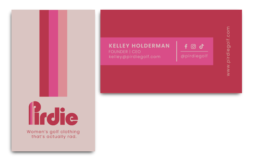
PIRDIE
An all women lead golfing brand looking to make a statement. Pirdie brings a new spin on the retro vibes of California. Pirdie’s projects range from custom promo branded tee cards to general branded collateral. Check out the apparel section to see apparel and headwear i’ve designed for Pirdie.


DESCHUTES PINEAPPLE WHIP FRUIT POP
An ale brewed with pineapple juice and vanilla flavors designed with the illustrative type in mind. I wanted to create a visual representation of the Pineapple Whip Fruit Pop name inspired by 50’s ads.
CONCEPT EXPLORATION EXAMPLES:
TILLAMOOK X TIMBERS
Concept, design, story board and art direction for 7 digital flags for Timbers x Tillamook score board. During each timbers game each goal is signaled to the fans with a banner fall with each flavor dictating a specific score. The banners play on a 18-foot-wide x 42-foot-tall LED video wall. I was inspired for this direction by the flags falling in Harry Potter Quidditch matches.


HOLYPEACH ZINE
An Art focused magazine highlighting local venues, artists, tutorials, and creative outlets. The zine was designed with an art aesthetic, highlighting each page with a large range of color palettes and bitmap textures. The mulit-edition zine includes varies layouts and type solutions.
DESCHUTES CATHARINA GUAVA SOUR
The Xicha x Deschutes collab centered around the aromas of guava and sweet tropical notes. The graphic focused on a typographic play combining three hand-rendered typefaces of varies styles and with a pop of guava inspired colors.
CONCEPT EXPLORATION EXAMPLES:
WUNDERBE
A children’s apparel and art subscription box kit centered around design. It’s all about the fun, the quirkyness and the art supplies available. Collateral pieces include embroidered tees, wunderbe subscription boxes, art tote bags, various prints for packaging and instragram, and additionally business cards and wunderbe creative of the month postcard.
KNOWN ASSOCIATES SOCIAL CLUB COLLATERAL
Known Associates Social Club is a creative hub to locals and visitors. The space itself is comprised of a live music lounge, a private chef’s dinner space, restaurant, bar and lounge, and art gallery. The space was designed to invite locals and visitors in the creative industry to come together in one space. The initIal inspiration behind the space was John Wick’s Hotel for assassins. Collateral played with the star repeat pattern, custom cocktail drinks and moody blue jazz feel located in the basement bar. Logo details located in the branding tab under portfolio.
MOLECULE ZINE
Molecule Zine was created as an in-house zine for Austin based restaurant MoCu. The zine focused on molecular gastronomy cuisine and was designed as take home gift for patrons. The zine was designed with a contemporary layout and heavy food photography focus with color indicators and bold callouts.

PAPAMONTY
PAPAMONTY has been a passion project since 2013. It spawned from an event No Bones for Halftones where I designed the Portland Skull Tee. Patreons came to the event for a chance to get a free screenprint with all donations going to the event and local clothing companies who support houseless and unemployed members of the community. With the outpouring of support I received, i’ve since launched more products under the umbrella of PAPAMONTY all focused on a black and white aesthetic and custom typeface.
